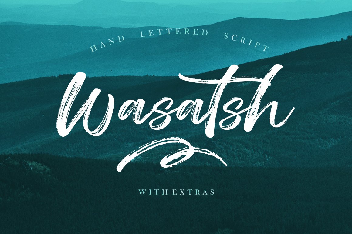
4 Reasons to Use a Premium Font or Typeface
Typography is two-dimensional architecture, based on experience and imagination, and guided by rules and readability.
Hermann Zapf, legendary German type designer (Palatino, Optima, Zapfino)
There are two classes of typefaces when it comes to licensing – free or premium. While there are plenty of options for each type of font, there are some distinct advantages to selecting a premium option.
Premium typefaces are often sold by larger foundries or are part of collections such as Typekit. Prices can vary widely.
- Premium fonts come with extended characters and glyphs. Have you ever run into a font that didn’t have an ampersand or comma? That’s a common problem with many free fonts, and isn’t the case with premium options.
- Premium fonts won’t degrade in quality when used at large sizes and have been tested to render on multiple browsers and devices.
- Premium fonts have a character consistently to ensure that the family looks like it goes together among different characters and weights.
- Premium fonts often include multi-language support and come with a license so you know when you are using it legally.
How to Install a Font on a Mac
Installing a font on Mac operating systems just takes a couple clicks, using the Font Book app.
After downloading the font (make sure to unzip it), double-click the font icon and a window will pop up in font book that shows the name and basic character set. Click install to add to your default font set, using default preferences. (You can change these settings in the Font Book preferences.)
How to Install a Font on Windows
Adding a font on Windows is equally simple. (Note that administrator access is required to install on Windows NT 4.0, Windows 2000, Windows XP, or Windows Server 2003.)
After downloading the font (make sure to unzip it), right click on the font file and select Install.
The alternate method is to open the Fonts Control Panel and Fonts Manager. Then drag and drop the unzipped font file into the Fonts Manager to install.
3 Tips for Pairing Fonts
Most projects aren’t a one-font design. Pairing typefaces is an art in itself, but it is a little easier with these tips to help you create amazing font pairs.
- Look for typefaces with similar shapes: Think about whether each typeface is more round or oval, thick or thin, or tilts.
- Mix type styles: Use a serif and a sans serif or a script and sans serif. Paring different type styles is more visually interesting than mixing similar typefaces.
- Create plenty of contrast: Typography pairs need plenty of contrast to stand out. Pair fonts in different sizes, styles, color and use so that each font serves a distinct purpose.
